Hello all! I wanted to extend a hearty hello to all my new subscribers!! I hope you enjoy the reviews and feel free to leave comments or feedback. Today’s blog post deals with book covers. I have been doing a lot of research on making my book cover posts (for social media and what not) more imaginative. I think for the ‘featured image’ (what you see on the main page) the close up book cover is the best.
But I wanted to know what you thought!
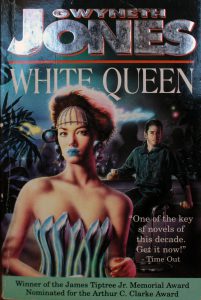
(This is an example of the ‘close up’ of the book cover)
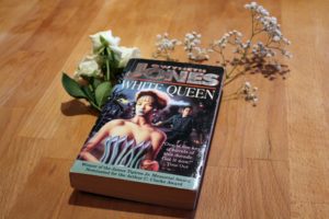
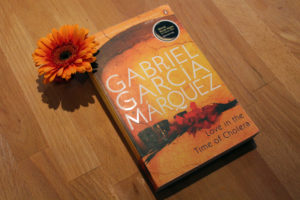
(This is an example of what an ‘artistic representation’ of the book cover is)
So, I want to know which you would prefer to see. I think there are very valid pros and cons to each and I could start integrating the more artistic image into the beginning of the review (see the White Queen review here).
I thought I would ask people to fill out a survey (and see what others thought).
Personally, I prefer the close up for the main page and then the artistic one for social media and as an image in the blog post. If you have any other feedback feel free to use the ‘Other’ option in the form.
Here is the survey!


